Build your own Bloomberg Currency Rates Matrix in Excel
Please note: This is not meant to replace a Bloomberg Terminal or be used for professional trading. Just an amateur project. More info on the data source here
Introduction
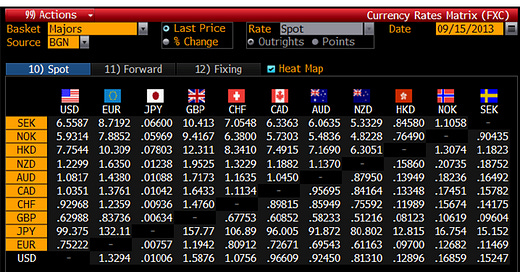
The Currency Rates Matrix (FXC) is one of the most well known functions on the Bloomberg Terminal. If like me you don't have a Bloomberg Terminal easily accessible, you may desire a way to get FX Spot rates in a similar format (at the time of writing, I am working from home due to the Lockdown so can't use a Terminal in the office). Or perhaps you're off on holiday to Spain and want to know the market rate, so you don't get ripped off at your nearby bureau de change (I've seen my local offering GBP/EUR at parity before, disgraceful). Anyway enough rationale, since 2016 Microsoft have built a handy function that allows you to pull market data into a spreadsheet easily. So, thought I'd have a go at rebuilding the FXC and I think its turned out alright. So I am sharing this tutorial with the world for free, hoping you'll learn something new.
Before we begin, please note you will need Microsoft Excel 2016 or above to do this. To find out if you can follow this guide, simply press the data ribbon on the top of Excel. If you see Stocks, then you can do this.
This will work on Windows, Mac and online versions of Excel. I have built this on Mac (my laptop cost a year's salary but was worth it). So if you do run into any issues on other platforms, please let me know and I can update the guide accordingly. No programming knowledge is required either, as I wanted to make this tutorial as accessible as possible. But an understanding of Excel is beneficial. At the time of writing, I am no expert of Excel or Financial Markets (not even graduated), so if do think of a better way to do this please let me know.
Step 1. The Data
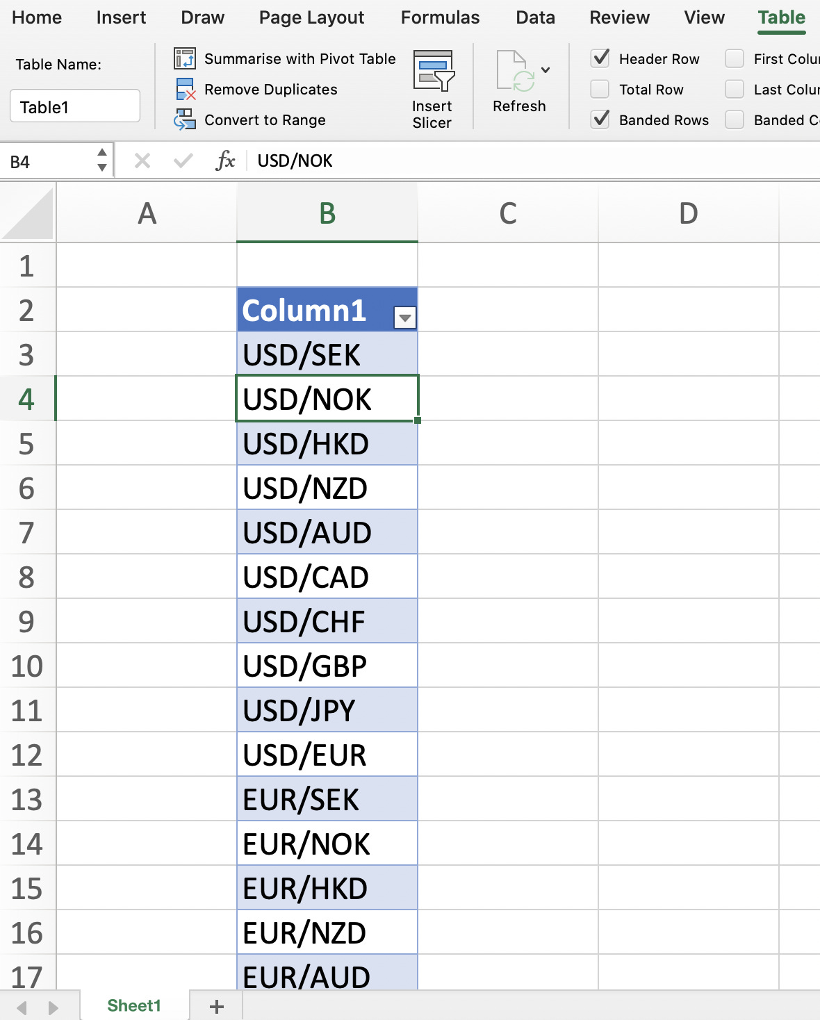
First, we need all the currency pairs written out. As this is quite a manual task, I thought I'd save you some time by providing the list:
USD/SEK
USD/NOK
USD/HKD
USD/NZD
USD/AUD
USD/CAD
USD/CHF
USD/GBP
USD/JPY
USD/EUR
EUR/SEK
EUR/NOK
EUR/HKD
EUR/NZD
EUR/AUD
EUR/CAD
EUR/CHF
EUR/GBP
EUR/JPY
EUR/USD
JPY/SEK
JPY/NOK
JPY/HKD
JPY/NZD
JPY/AUD
JPY/CAD
JPY/CHF
JPY/GBP
JPY/EUR
JPY/USD
GBP/SEK
GBP/NOK
GBP/HKD
GBP/NZD
GBP/AUD
GBP/CAD
GBP/CHF
GBP/JPY
GBP/EUR
GBP/USD
CHF/SEK
CHF/NOK
CHF/HKD
CHF/NZD
CHF/AUD
CHF/CAD
CHF/GBP
CHF/JPY
CHF/EUR
CHF/USD
CAD/SEK
CAD/NOK
CAD/HKD
CAD/NZD
CAD/AUD
CAD/CHF
CAD/GBP
CAD/JPY
CAD/EUR
CAD/USD
AUD/SEK
AUD/NOK
AUD/HKD
AUD/NZD
AUD/CAD
AUD/CHF
AUD/GBP
AUD/JPY
AUD/EUR
AUD/USD
NZD/SEK
NZD/NOK
NZD/HKD
NZD/AUD
NZD/CAD
NZD/CHF
NZD/GBP
NZD/JPY
NZD/EUR
NZD/USD
HKD/SEK
HKD/NOK
HKD/NZD
HKD/AUD
HKD/CAD
HKD/CHF
HKD/GBP
HKD/JPY
HKD/EUR
HKD/USD
NOK/SEK
NOK/HKD
NOK/NZD
NOK/AUD
NOK/CAD
NOK/CHF
NOK/GBP
NOK/JPY
NOK/EUR
NOK/USD
SEK/NOK
SEK/HKD
SEK/NZD
SEK/AUD
SEK/CAD
SEK/CHF
SEK/GBP
SEK/JPY
SEK/EUR
SEK/USD
Copy these into a column in excel and create a table. Should look something like this.
Select your entire table, go to the Data ribbon and press Stocks. This will convert the currency codes into a data source. If there is now a building icon next to each currency pair, it has worked.
Okay this is the really cool part. Press any cell in the table. A small square box with a plus sign should appear on the top right of the table
When you click this little button, you will get options such as 52 week high, change and more. All we need is Price and Change %. Once you've added these, your table should now look like this.
You'll notice the cells in the Price column have various currency symbols and the Change (%) column cells are expressed as %. We don't need either in this format so simply select both columns, go to the Home ribbon and press Number Format > General. All currency symbols and % signs should now be removed.
So we now have a table with all the key data. Brilliant. Simply by pressing Refresh All in the Data ribbon, all this data will update to the latest information. You could stop here to be honest, you can now pull live currency data (it is slightly delayed) into a spreadsheet easily. But if you want to build the mighty and powerful FXC (I'm trying to make this topic less dry), please proceed.
Step 2. The Main Grid (FXC)
Create a new sheet in Excel. This is where the FXC itself will be displayed. Write out all the currency codes in a grid like this
Let's start with filling it out from the left. Select the cell I have above (USD/SEK or C6 to be precise) and reference the cell in your data sheet from Step 1, which in this case is the USD/SEK price cell. Your formula should look something like this and I've put an English translation next to it
=Sheet1!C3 In English: Show the contents of this particular cell in another cell
Now just pull this cell down (so the one below that =Sheet1!C4, below that =Sheet1!C5 etc). Remember USD/USD should be empty and to apply the same rule for all other currencies. Now fill out the rest of the grid (EUR/SEK for me was =Sheet1!C13 and JPY/SEK =Sheet1!C23, it should follow a similar pattern your end). Your completed grid should look like this
You now have a functioning FX matrix, great. If you're happy with this, just skip to step 4 to match the FXC design. However, if you want each currency price to change colour if it has appreciated/depreciated day on day (quite useful), move onto Step 3. This is the most complex part, but it's not as challenging as pricing interest rate swaps.
Step 3. Percentage Change Highlighting
Copy the grid you created in Step 2, to your other sheet with the data table. I had a box pop up warning me "There are one or more circular references..." just press okay, we will fix this. The new grid we have copied, will reference the Change (%) column in our data table. So starting from the left again, the formula for USD/SEK should read something like this if you have replicated my screenshots so far.
Sheet1!=D3
This should display the percentage change of the specific currency pair. Fill out this new grid (should follow similar rules to your last grid e.g. EUR/SEK =Sheet1!D13, JPY/SEK =Sheet1!D23 etc), your completed grid should look like this
So this grid shows the percentage change day on day for each currency pair. We will now get it to feed into our FXC. Let's start by creating some percentage change bands. On your data sheet, create the following (see cells G16-G22 below, putting it in the same place is highly advisable for the next part).
Now go back to your sheet with the FXC on (the one we built in Step 2). It's time for conditional formatting, he says with dread. Select all the cells in your grid, go to the Home Ribbon and press Conditional Formatting > New Rule. Select Classic as the style and choose the option which allows you to "Use a formula to determine which cells to format."
Let's start with the easy one. If a currency pair has appreciated by greater than 2.5%, turn the cell bright green (if you're familiar with the Bloomberg Terminal this hopefully makes sense). The formula should look something like this
=Sheet1!H3>Sheet1!$G$17
What's the English translation? Well, if H3 which is USD/SEK on our percentage change grid, has a value greater than 2.5%, then the USD/SEK cell on our FXC grid will turn bright green. If you don't understand no problem, when this is finished it will make total sense. These are the rules you need with an English translation next to them, along with the colours you should set them to turn.
=Sheet1!H3>Sheet1!$G$17 In English: If % change > 2.5% turn bright green

=AND(Sheet1!H3>Sheet1!$G$18,Sheet1!H3<Sheet1!$G$17) In English: If % change > 0.5% and < 2.5% turn green

=AND(Sheet1!H3>Sheet1!$G$19,Sheet1!H3<Sheet1!$G$18) In English: If % change > 0.05% and < 0.5% turn dark green

=AND(Sheet1!H3>Sheet1!$G$21,Sheet1!H3<Sheet1!$G$20) In English: If % change > -0.5% and < -0.05% turn dark red

=AND(Sheet1!H3>Sheet1!$G$22,Sheet1!H3<Sheet1!$G$21) In English: If % change > -2.5% and < -0.5% turn red

=Sheet1!H3<Sheet1!$G$22 In English: If % change < -2.5% turn bright red
To get the colouring to replicate the Bloomberg Terminal, just use the eyedropper tool on the screenshot at the start of Step 4 (the % change on day table at the bottom). So your conditional formatting rulebook should look something like this (this doesn't show the < -2.5% rule, but it is there).
So your FXC grid will now change colour depending on the percentage change of the specific currency pair, well done. For a demo of what it should do, see the 2 screenshots below (first shows the percentage change grid, the 2nd is the FXC).
Step 4. Matching The Design
We're just recreating the look of this.
If you don't like the design or think yours could be better, go wild and move onto the Conclusion. However if you want a replica, change your FXC sheet to have all black cells and white text. Font style should be Arial (Bloomberg Terminals now have their own font, Arial is what they used to have). For flags, just download the relevant flags from Google Images. Add the other bits (% change on day table etc) and it should now look like something like this
You'll notice I have added a Latest Snapshot feature in the top left. Why? Because this tool requires manual data refreshing, so I wanted to know what time I last pulled the data (I'm sure with VBA it could be automatically refreshed, but I wanted to make this tutorial accessible to a wide audience).
Conclusion
So you've built a Bloomberg Terminal Module in Excel, congratulations. To use it simply open the spreadsheet, go the Data Ribbon and press Refresh All, which will update all cells with the latest data. That's it. Uses of your new FXC include becoming the next Travelex, shorting GBP like George Soros, or waiting for Switzerland to suddenly announce a de-peg and watch your grid light up like a Christmas Tree (although you're a few years late to that party). The possibilities are endless. Thank you for reading, if you learnt something new then great, I've done my job. Please leave a like if you enjoyed this or a comment if you've got any feedback or questions.


